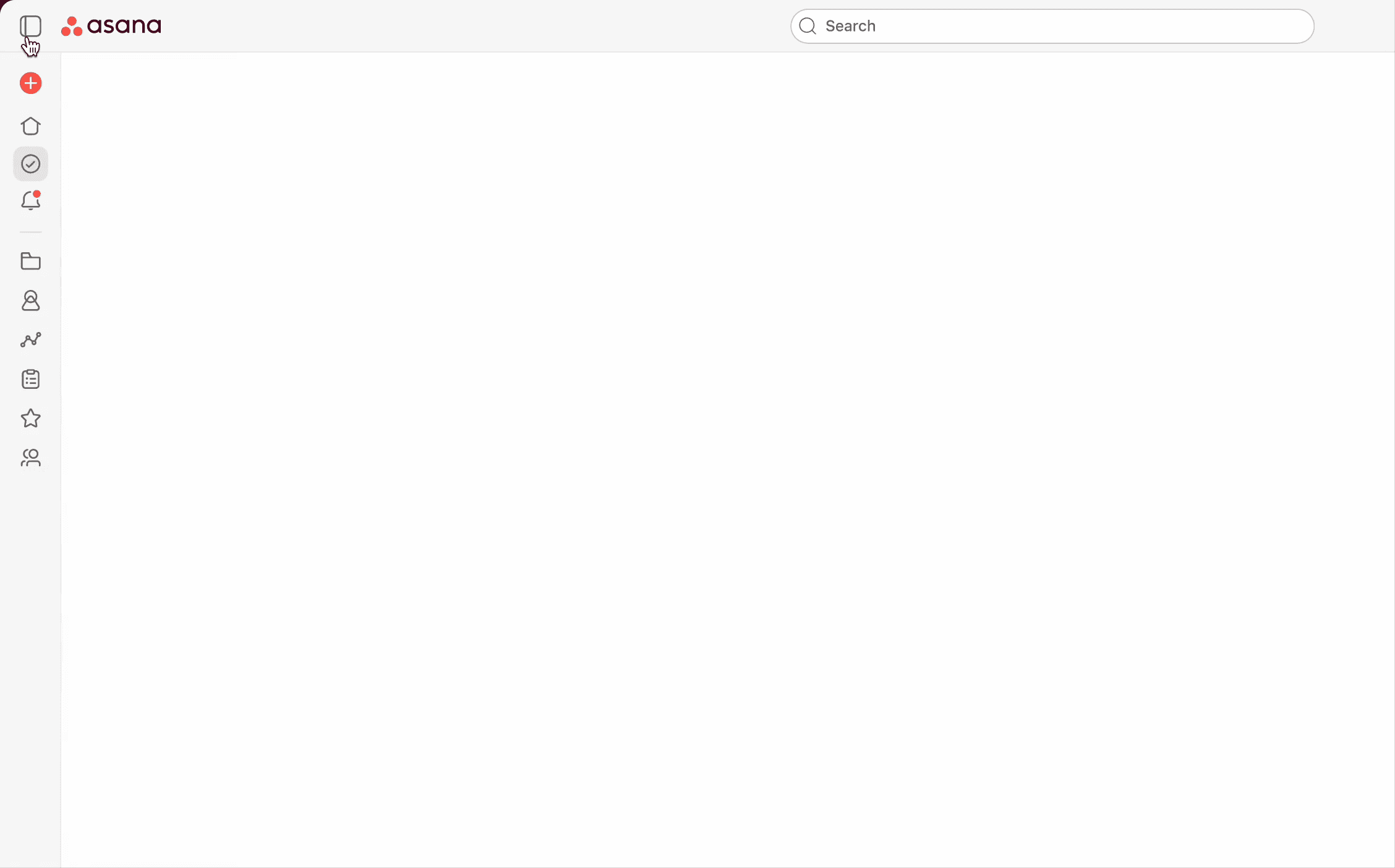
Sidebar
My role
Sole designer. Worked with my PM, Bill and design manager Bona. This was one of my first projects on the navigation team.
Background
This project already had buy-in when I joined the team. We were addressing a clear navigation gap: Asana users don’t always have access to the sidebar—especially on small screens or when they manually collapse it. In fact, 17–20% of users load Asana on screens where the sidebar is auto-collapsed.
Our idea was to introduce a “minibar”, a compact version of the sidebar that appears when the full one is hidden. The goal was to maintain navigation access while helping users stay focused on their work.
Refreshed sidebar & mini-bar
Through multiple iterations, I arrived at a solution that balanced elegance with improved functionality—both in the fully expanded sidebar and the new collapsed minibar.
The expanded sidebar received a full spacing and sizing overhaul to better support the transition between states and to improve the overall grouping and readability. We also reintroduced the logo in the top bar (more on that below) and relocated the create button into the sidebar.
The collapsed minibar condensed the UI down to essential iconography. This required refining a few key icons, particularly the inbox/notification icon to ensure clarity at small sizes. One of the main design challenges was preserving navigability in this collapsed state. We solved this by using hover interactions that supported key workflows.
Bringing the logo back
As Asana expanded further into the enterprise space, we had several reasons to bring the logo back into the top bar.
First, it reinforces brand presence. Placing the logo front and center not only anchors the interface visually but also adds a sense of polish and confidence, an important signal, especially for enterprise customers.
Second, it laid the groundwork for future white-labeling efforts. By creating a configurable logo space, we enabled premium customers to replace the Asana logo with their own, making the product feel more personal and aligned with their company identity.

Interactions and animations
As with every project I work on, it’s the interactions and polish that really brings the experience together.
While the sidebar already had resizing built in, I found the ability to resize-to-collapse intriguing and another way for the user to discover that they could do this.
Whether it was triggered via resizing or the explicit collapse button, I worked closely with engineering on refining the open and close animation so that it was as seamless as possible. The result is a sidebar where the first group of icons remain consistently in place while the bottom group of icons faded into conformity regardless of whether they were expanded or out of view - one of the bigger animation challenges that faced me.

Exploratory toggle button animations
Trialing experience
While this initially seemed like a straightforward assignment, it quickly became more complex—and ultimately contributed to the project shipping in a more limited way than we had hoped.
There were several moving parts at play, including an overlapping request to relocate the trialing user information (as shown in the example card) out of the top bar. This work intersected directly with the sidebar redesign. A blessing and a curse.
In the end, the growth designer and I landed on a solution that satisfied multiple stakeholders while still keeping the trialing user experience front and center.

Results
The updated sidebar tested well with paying customers and received strong internal support. However, during trials with new users, we saw a negative impact on revenue forecasts. Without going into details, we made the decision to partially ship the experience, rolling it out to paying customers while continuing to evaluate its broader impact and iterating this into a place of success for trialing users.


