Eventbrite consumer app
My first year and project at Eventbrite was helping to rethink and redesign the consumer app experiences on Android and iOS.
Working from a solid foundation
While the existing apps had strong reviews and a loyal user base, they hadn’t been updated in some time, leaving the design feeling outdated both visually and in how it connected with our audience.
The destination
Guided by defined personas and user testing, we iterated toward a final design that captured Eventbrite’s personality while directly addressing user pain points. We made it a priority to preserve what users loved about the old app and improve the areas that needed work.
Spotlight: Home feed
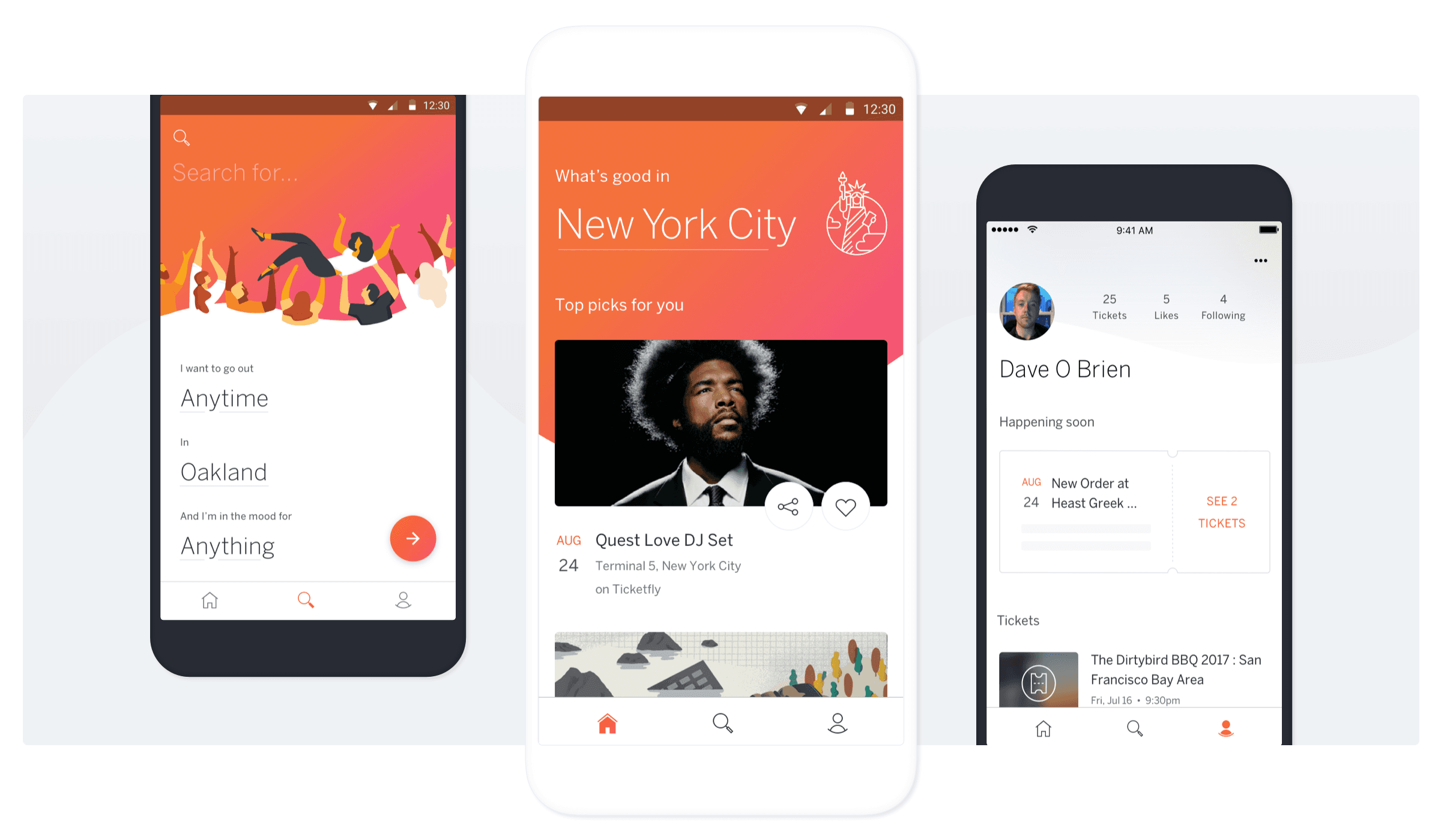
One of my main focus areas was the home feed. While the previous app surfaced nearby events, we saw an opportunity to do much more, especially around personalized recommendations and introducing new content and features in a more engaging way.
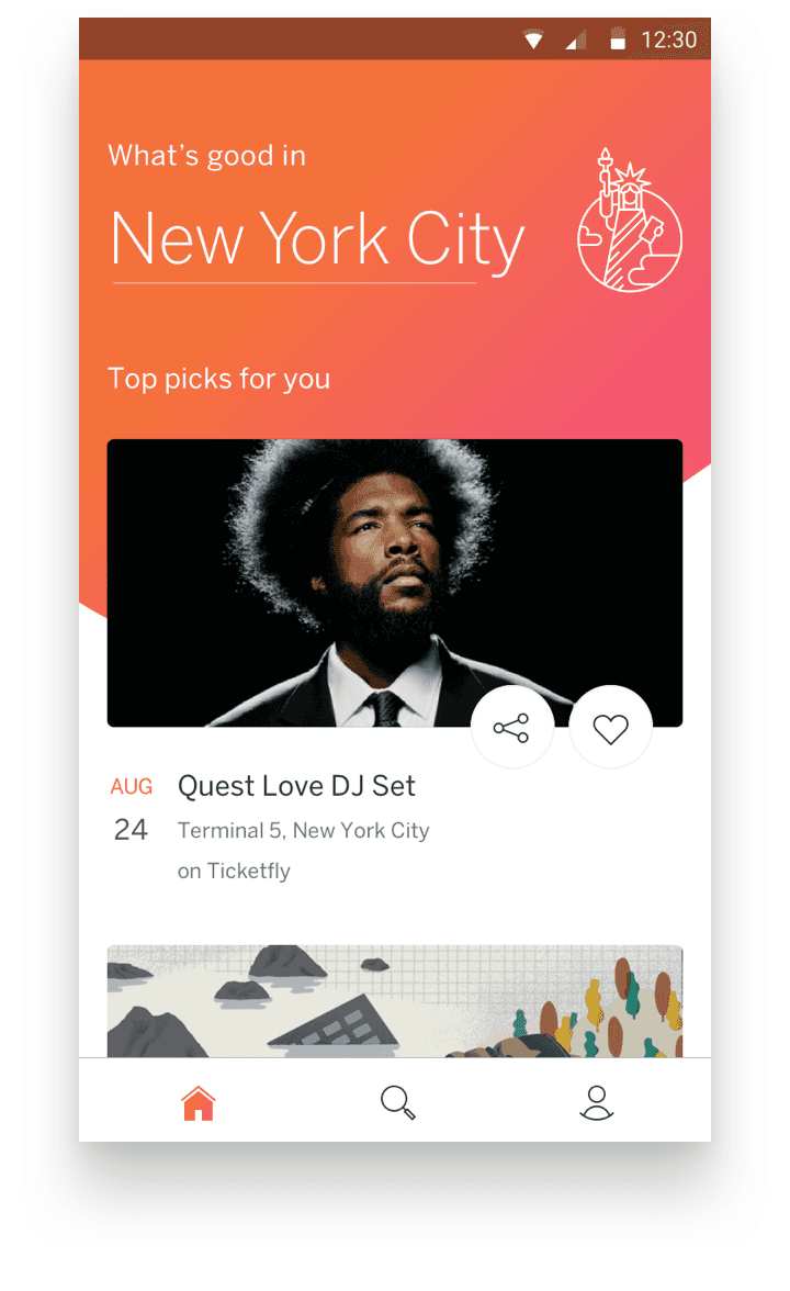
Inviting
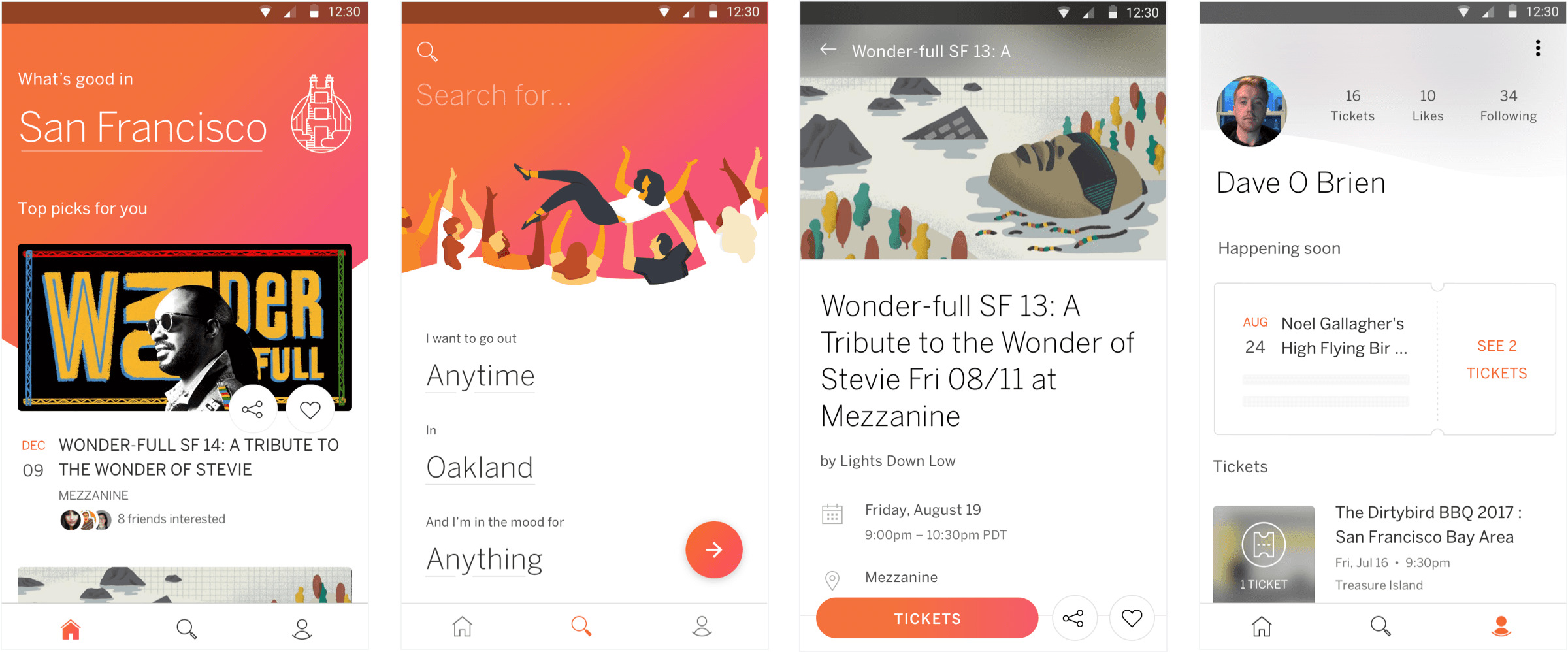
At the top of the feed, we celebrated the user’s city with bold typography, a custom illustration, and a signature splash of color that carried through the app.
Just below, we highlighted highly personalized event recommendations with visually rich cards featuring large imagery and clear, concise details.
Coverage
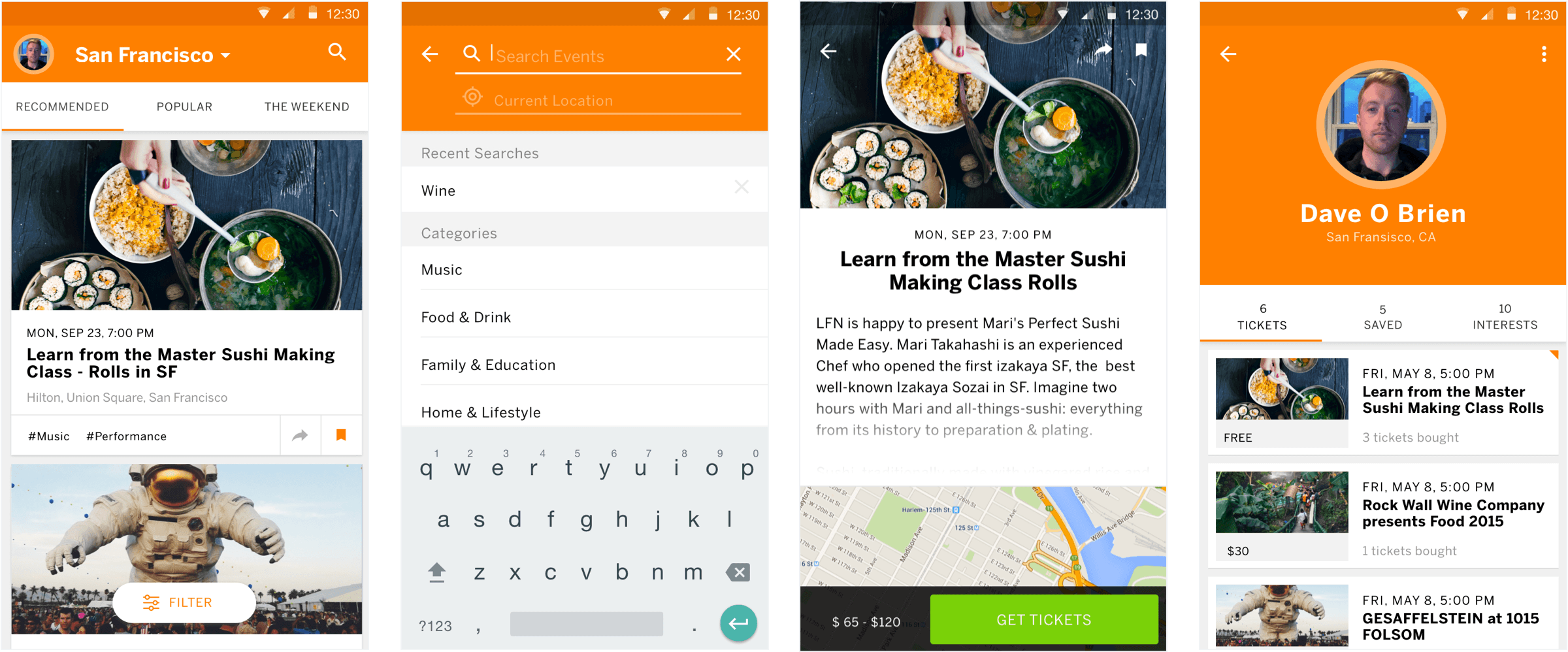
As users scroll through the feed, events are grouped into carousels based on their interests—like music or, unsurprisingly, free events, which tested especially well. To avoid dead ends, each carousel ends with a “see more” card that deep-links to a category-specific search, encouraging further exploration.
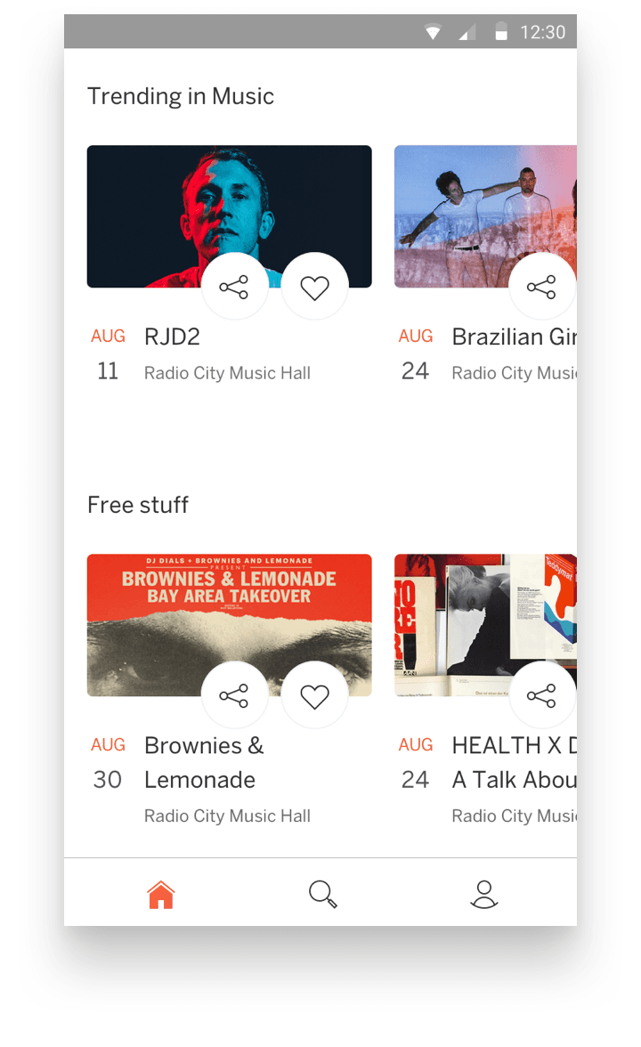
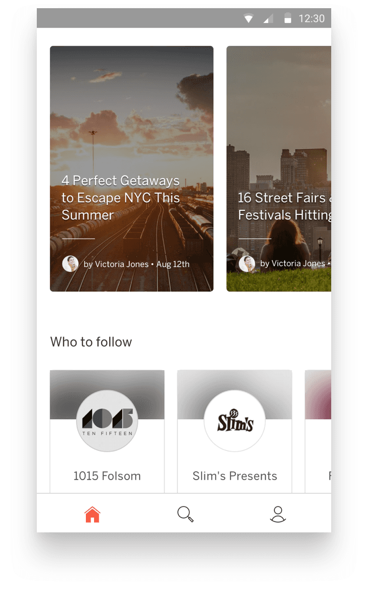
Options
We introduced new features like personalized article recommendations and the ability to follow profiles—starting with event organizers and eventually expanding to venues and artists. Collaborating closely with Eventbrite’s editorial team, we integrated their content directly into the app, creating a richer, more connected experience for users.
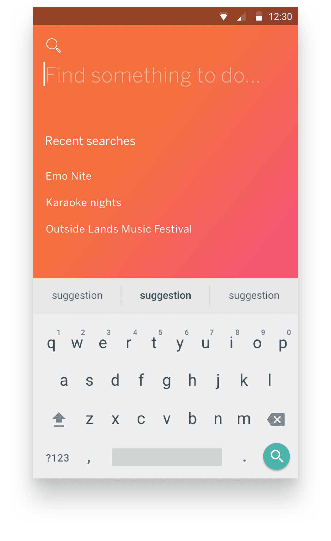
Spotlight: Search
Search was a part of the app I was especially drawn to. While the old experience was utilitarian and direct, I saw an opportunity to elevate it using the entry point not just for queries, but as a place to surface timely, curated, or niche content that didn’t always make sense on the home feed.
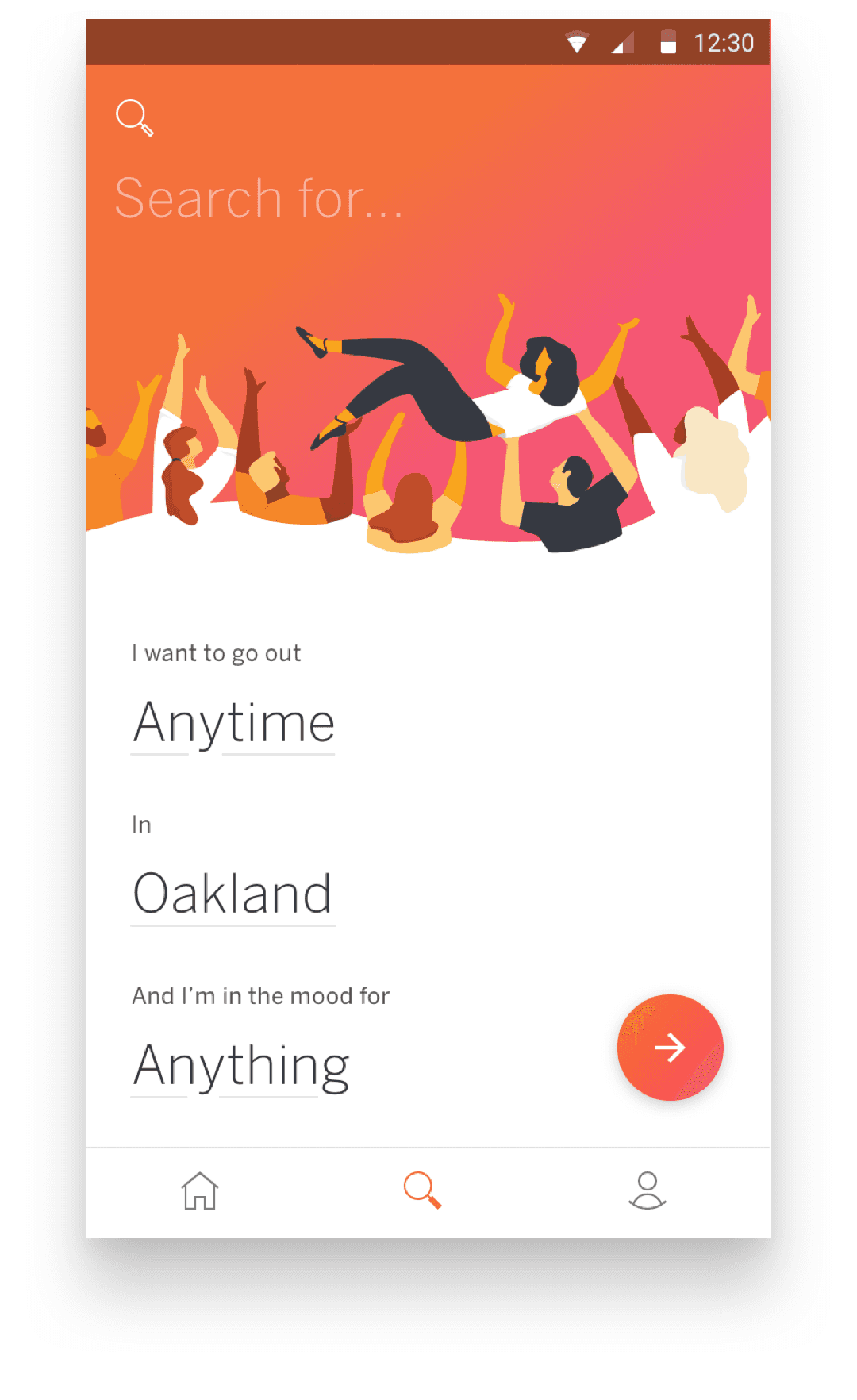
Personality
As the app evolved, it became sleek and modern but also risked feeling too minimal and sterile.
To bring back some warmth and personality, we collaborated with an illustrator in Mendoza to infuse the search screen with playful, energetic visuals that made Eventbrite feel like that lively friend who convinces you to go out on a school night.
Seamlessness
I was passionate about making the search experience feel like a single, fluid surface, only transitioning once a search was submitted. Like the home feed, it featured bold, inviting type and a colorful wave that expanded into a full-screen gradient as you engaged with it, making the experience feel playful and seamless.
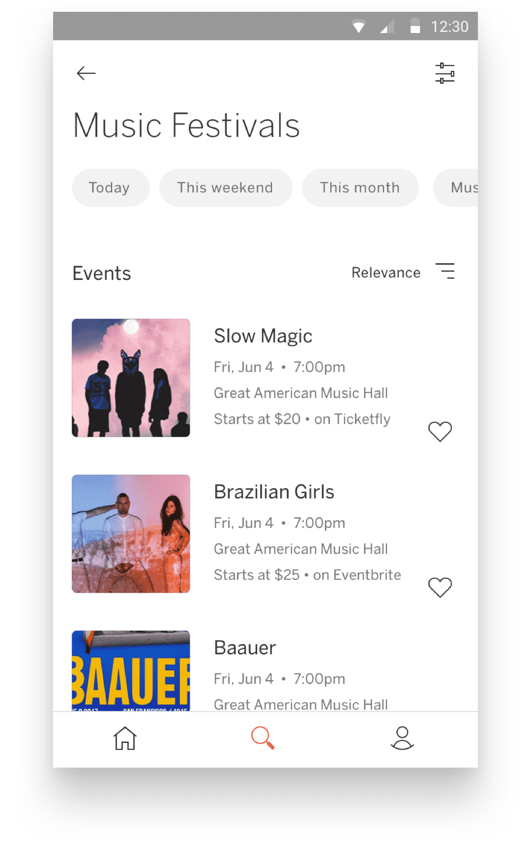
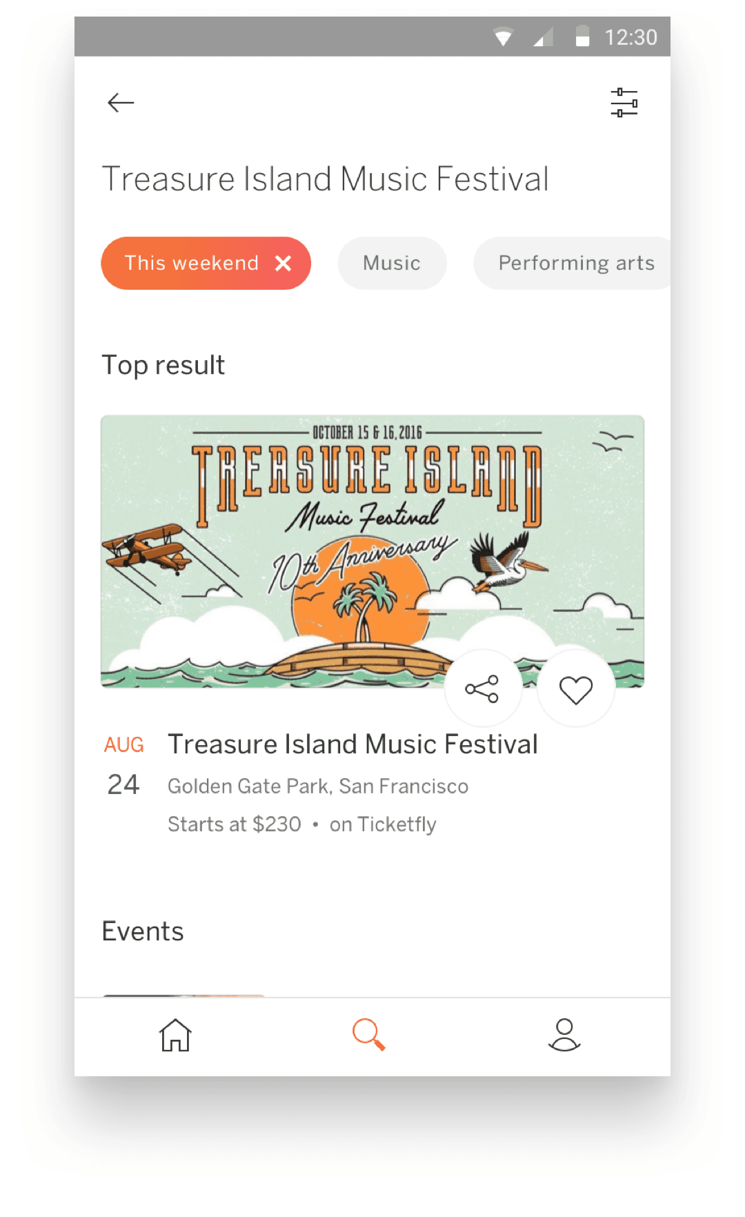
Results
Search results were designed to be simple and honest, letting content take the lead. Filters mirrored the mad-lib-style query builder, helping users refine even broad searches like “Music Festivals.” We used compact cards for visual clarity, carefully balancing space and key details.
Refining
When a user selects a quick filter like “This weekend,” results update accordingly. Other “Where” filters are cleared, and relevant “What” tags appear to help refine the search even further.
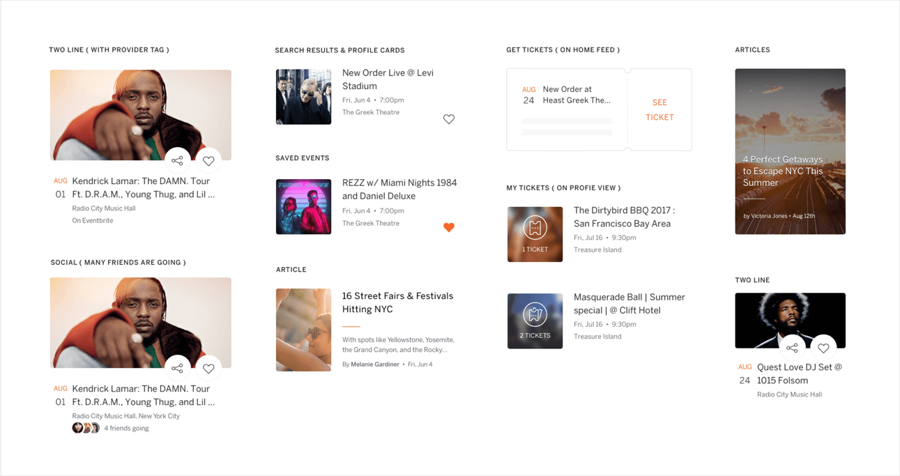
Card system
This is an overview of the cards that I built for the apps. I would often design from a file with a layout similar to this in order to have a birds eye view of the whole family. It was vital to see how one change to one card could ripple and disrupt the balance and expectation of others.
Icons
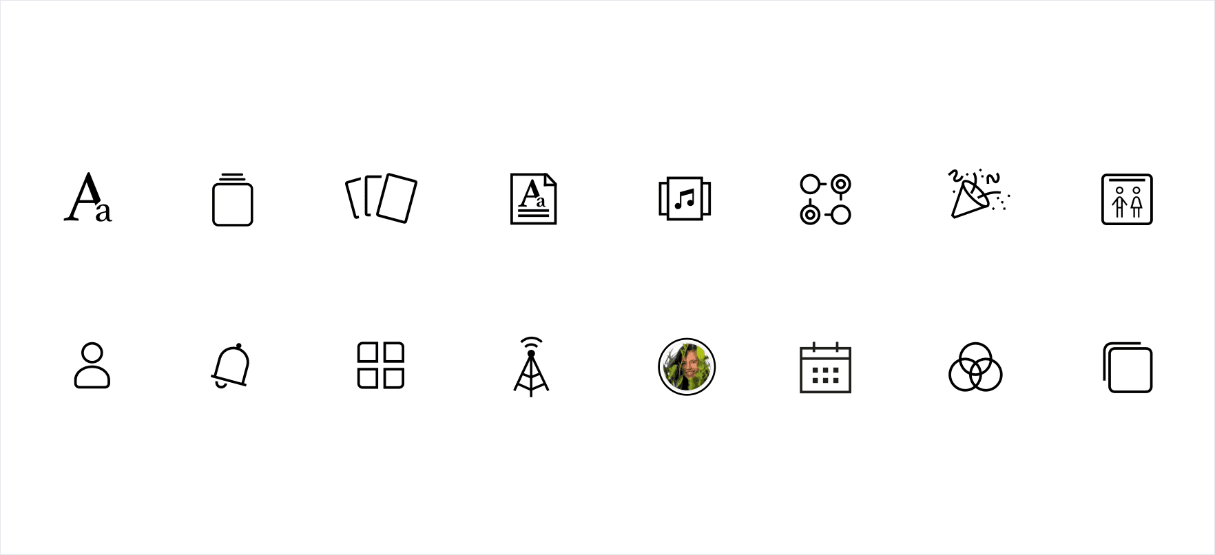
A collection of icons that I worked on for various iterations of cards and features that didnt make it into the app.